Monday, November 29, 2010

Design Is Dangerous: Ford Model T


When automobiles became popular the Ford model -T was one of the most popular. The early designs of automobiles in that time were pretty dangerous compared to the safer models released today because they lacked a lot of the safety features that keep passengers safe. The model- T was a basic design of a car because it had no seat belt and huge openings on the top. Even starting the car would cause people to hurt their wrist from the crank. The car could potentially reach 45 mph which can cause fatal collisions.
                The model-T in society was meant more to be of convenience for society by providing transport but also cause many fatalities. By mass producing these automobiles the cars could be assessable to more people which can in turn cause more danger to drivers. The model-T wasn’t designed as a way to be dangerous but was an attempt to make things more convenient to all citizens. The model-t did lead the way for more cars to be designed the way they are today. The car gave people more power and freedom to do what they wanted but did not allow people more designs to control the power. Overall the model-T helped society more than it potentially damaged it.

Design in Society: Umbrella


The umbrella does a lot to make society better by giving people a way to avoid outside variables to influence the user. Umbrellas though simple are shields that defend its holder from aerial bombardment of any kind from above. By providing this protection to citizens, the umbrella takes out factors that can potentially conflict with how society can function. Without a umbrella, a citizen is exposed to dangerous elements such as rain and sunlight that can cause them to be distracted with and potentially waste time.
                The umbrella’s shield design alone is not the only factor in which it betters society. The portability of umbrellas also provides society with power to work more efficiently by allowing people to carry a umbrella easily when not in use. The does what most designs do which is to make life more effortless. By keeping a person out of exposure they can in turn be more productive in their contribution to society. Umbrellas main purpose though is to keep a person dry from the rain and its design has traits that show that’s what it is made for. For example the water proof material also provide the convenience to the user by being about to dry quickly. The umbrella though simple, can make societies more productive in how its citizen can get goals done.       

Color Transforms: Red and Blue 3D Glasses


A good example of color transforming a design is the way classic red and blue 3d glasses transform the way a person view the design of a movie. It transforms a movie by making a movie more realistic and close, as if the movie was right in front of you. Now there is new 3d technology that uses other methods beside color, but the original cheap cellophane glasses still remain popular in culture and are looked at as a symbol for the genre of 3d in general. 
                3d glasses represent a lot of Albers key concepts like how color can be deceiving to people and be only subjective. People are given an illusion of what is real but truly the action in the movie is not physically there. What the glasses do is make the illusion of depth in picture by being blended into the blue and red of the glasses which are right in front of the eyes. Without the glasses a person would only be looking at a blue and red image. The design of the glasses continues to perpetuate the image only existing in the mind and not in reality. The content of the movie is then more engaging by giving the audience a more interactive experience.    

Monday, November 15, 2010

Hungry Hungry Hippos


The design of Hungry Hungry Hippos has made me interested why it is so appealing. Aesthetically the game is very colorful and engaging to people because of its bright colors and cartoony characters. The game is so simply to play which is by simple pressing one lever over and over to get all the marbles. The variation of color gives the board game playfulness and attracts attention of lookers with all the primary and secondary colors. The sound of the game also makes attention by the constant chomping of the hippo mouths on the board. Overall all the interactions with the game invite more attention to the game.
                I’ve always wondered why hippos where used rather than any other animal like crocodiles or lions. Hippos, I guess were more nicer and playful looking but I thought it was uncreative for the board game makers to make the marbles not seem like any kind of food at all. The game design in general, is unusual because of colorful hippos always hungry for white marbles bouncing around everywhere. Compared to other games like Operation there are themes but Hungry Hungry Hippos is just no strategy and no motive. I think that’s part of the appeal because of its simplicity where anyone can play anytime and anywhere. The design has also become a symbol everyone knows when seeing a group of colorful hippos. The lack of complexity from Hungry Hungry Hippos gives a freedom compared to other games to have fun and be a child again.     

Egonomic Critique : Wii Remote


In recent years, games have become more interactive with people through things like instruments, touching, and dance. The most talked about is Nintendo’s Wii remote which can take the role of several interactions. The Wii remote uses new ways to let the player interact with the game with accelerators for all three axes and infra-red to point on the screen with a cursor. The ergonomic factors of the remote allow users to easily engage in games and build a more general audience.

                When the Wii mote first came out with the Nintendo Wii, there were many reports of hand straps breaking and causing damage from flying Wii motes. After that Nintendo released a stronger strap to fit on the problem was resolved. In the factor of safety the Wii mote fails with its small solid design, but after 2008 Nintendo released an add-on to the Wii mote called Wii Motion Plus which came with a silicon jacket to cushion the rectangular corners. The bulky form is clearly a design error but later makes up for aesthetics and design simplicity. Overall the Wii mote is relatively small and shouldn’t be a major problem for safety as much as any other remote is.

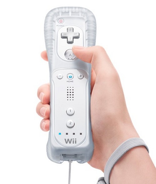
                The Wii mote’s comfort is a part of its appeal because of the design is a lot like a remote control where a person can hold it with one hand or two (if using the nun chucks) and can be done by mostly anybody. The new silicon jaket allows for more grip and comfort. Its wireless capabilities prevent the user from uncomfortable wires bugging them. The strap on the controller also gives users the comfort in insuring the controller does fly from their hand. Having generic grip gives no favors to any hand size which invites that anyone can use it the same way. 

                 The ease of use is one of the best factors on the Wii mote because it relies on people to easily pick it up and start playing. Compared to older game controllers the Wii mote can be used in one hand and has less buttons to make playing less complicated. Also the controller has a variety of attachment it can fit into to be more convenient for certain games like shooting and racing. The most major thing is the emphasis in the use of motion and buttons to make game playing simpler to learn from all ages. A child or a grandparent doesn’t have to read instructions to move the cursor on the screen.
                How the Wii works is by using three accelerators, one for ever axis, and it senses motion. There are certain limitations of the controller like not being rotatable, but in the Wii Motion Plus update the Wii remote can rotate freely allowing people to interact even more. The Wii mote is not complicated at all and interacts with ease with the user. Even though it’s wireless there is little problem with the signal it gives and if it runs out of battery it can recharged with the charger that can be bought. Basically the performance of the Wii mote is something people don’t notice because it runs so smoothly without disruption. 

                The overall aesthetics of the Wii mote is simple similar to Apple’s design to iPods and computers. The item is support to be a universal tool that can be applied in any situation so it has no favoritism to any way to use it. If the controller was more like a TV remote, it could be harder to drive, paddle, stir and shoot with. The Wii mote is a basic block so that it’s not associated to any kind of object.
                The Wii mote’s ergonomic factors especially the ease of use and the productivity make it possible for mostly any social group to interact with it. The Wii mote has certainly become a success because of its outselling of units compared to its competitors and it imitators like Microsoft’s Kinect and Sony’s Move. The Wii remote has formed a new interaction with users and games, making games more a part of our social lives similar to how internet and cellphones have become universal.             

Monday, November 8, 2010

Warhol: Campbell Soup


A piece of art I’ve always wondered about and keeps haunting me is Andy Warhol’s “Campbell Soup” painting. When I was younger I never understood it but now I see it as a unique piece of art. Certainly Warhol’s art is controversial and in this case he tells about the commercialization of modern society. The soup can painting was made the same way objects are manufactured in factories. The painting is a piece of art but it doesn’t show any creativity at all because it looks machine made. The simplicity of the colors shows the lack of input of the artist.
Overall the painting makes others questions of whether Warhol is making art or a commercial illustration. The art is so simple in its form because it uses simple font and color that isn’t reproducible by hand and brush but rather something that is machine made. It’s unique because it takes something from the world around us and makes it into a painting. The painting technique is the most creative thing Warhol used which is silk-screening. The idea is more important than the painting. In order for the painting to have a better meaning you have to know the context of how it was made.

Word and Image: Scale of the Universe

http://www.newgrounds.com/portal/view/525347


When playing this new game online, I became interested to blog about it because it’s another sign of interactive art getting recognized. This game was a lot similar to another blog I talked about in the zoom quilt but in this case the art relied more on the words than images. The game is an interactive encyclopedia of the sizes of things in all of existence from the string theory to the entire space time continuum. The words and image both work together to clarify each other. The words tell what things are, and the images let viewers compare the sizes of different objects to one another. 


                The style of the game gives the opposite of a narrative because it lets viewers compare anything they want with each other. All the images are not detailed because they give a general meaning which is its size. The words and images communicate only the idea of size and because of that the maker can add more content because they know the message of their work. The words give a more realistic meaning to the images, to further show the size of everything around us. Without the words there would be a confusing bunch of illustrations and without the images the words couldn’t really be compared to each other.